Monica Reyes Title Insurance Branding

Brand Identity Guide Book

March, 2026

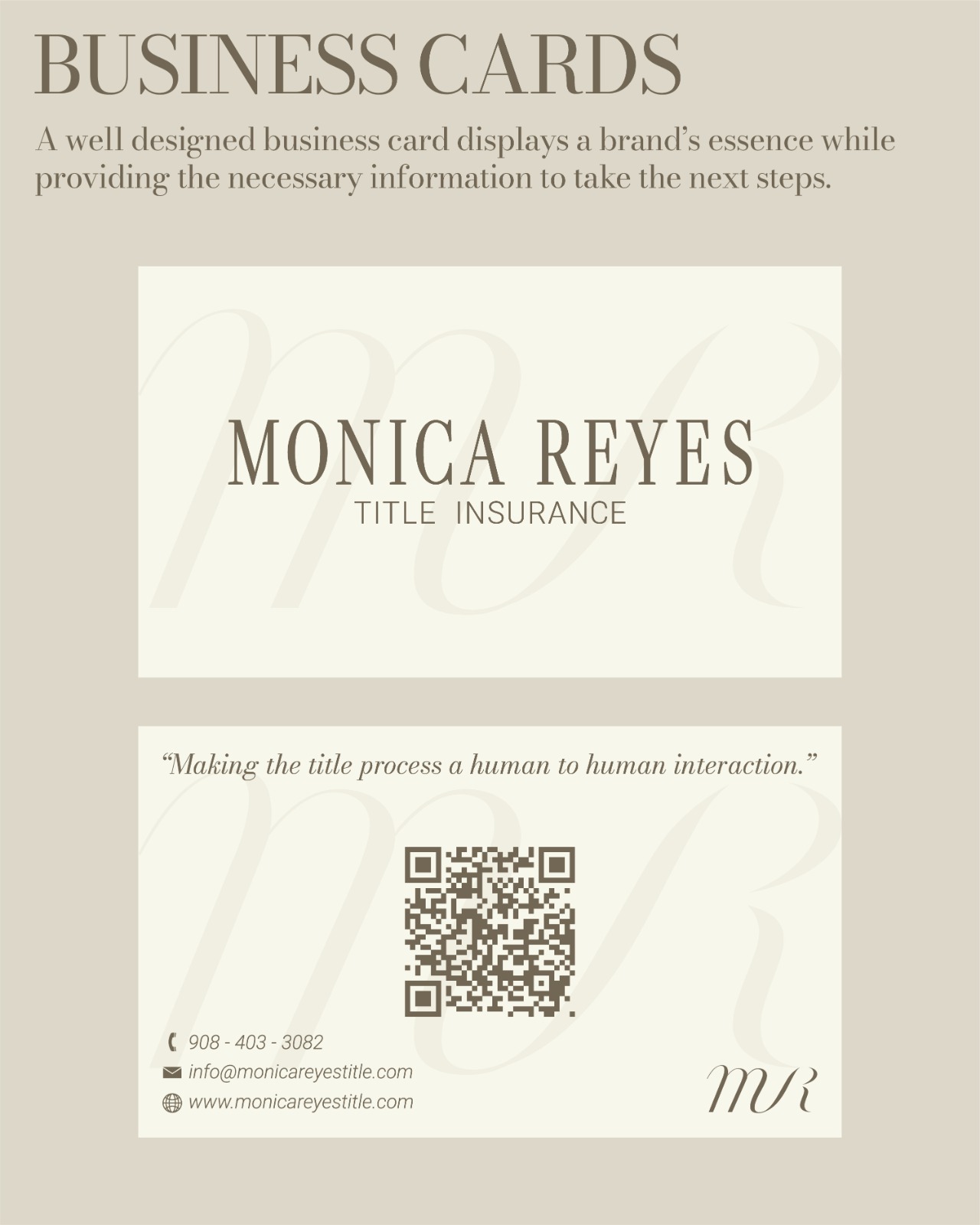
A brand book designed for a title insurance agent to improve her brand recognition and make a lasting impression on any viewer.

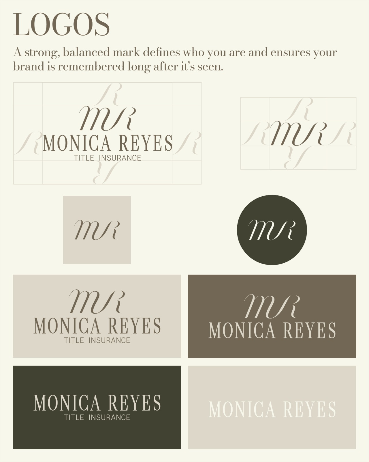
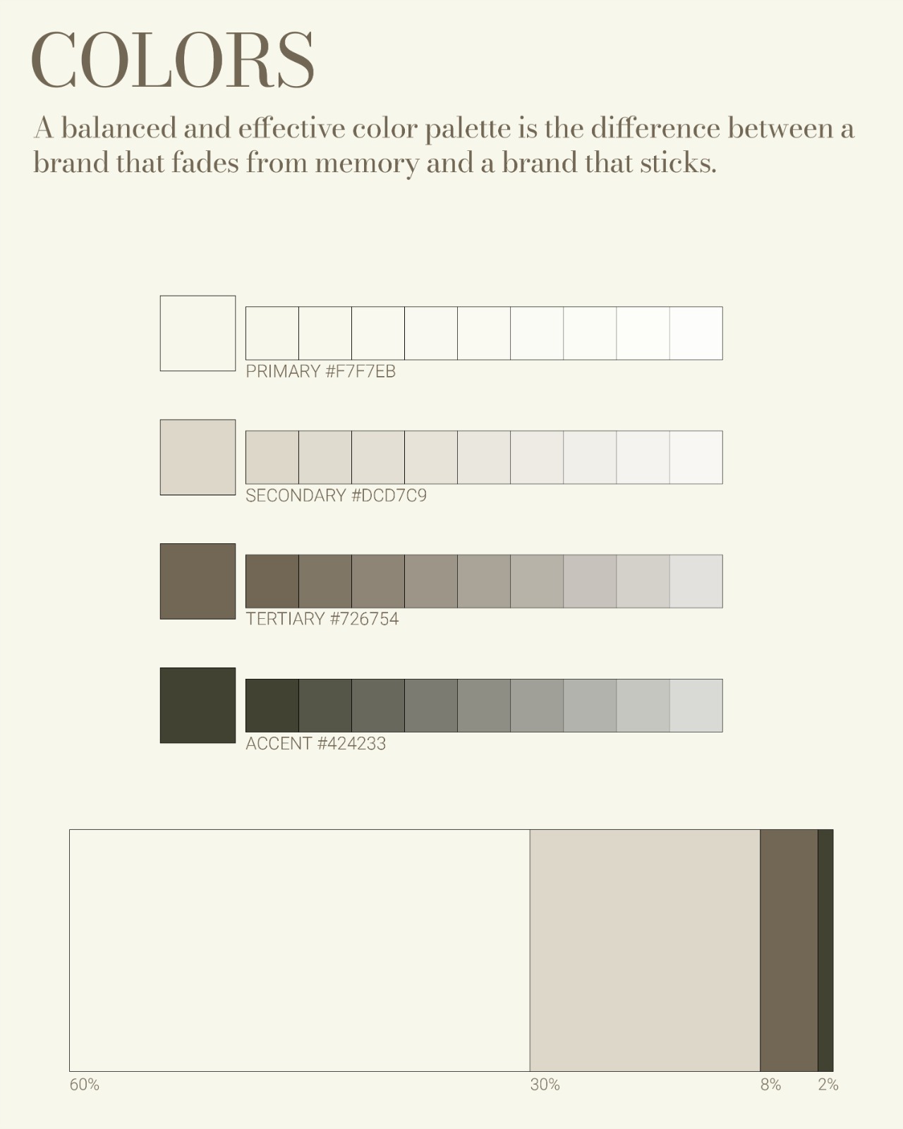
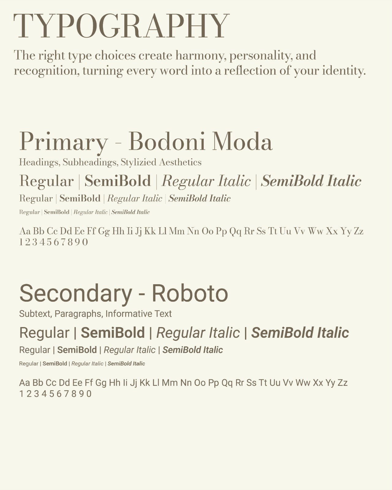
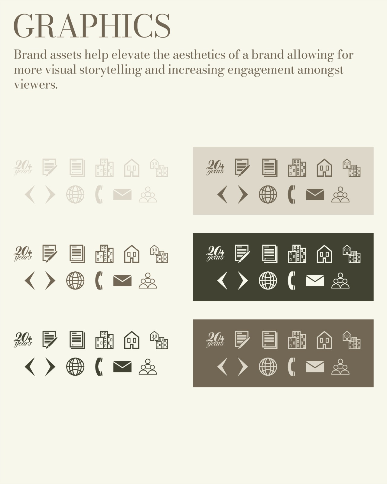
This is a brand book that has been designed through extensive market research and strategy implementation. A full brand identity system meant to serve as effectively as possible. Complete with a well-established logo suite, color palette, typography, brand graphics, business cards and mock ups. Along with the visual identity, brand essence statements were included in the process. More than just aesthetics, this branding project encompasses everything that Monica Reyes Title Insurance stands for.

Cohesive Visuals

With soft earthy colors, strong typography, elegant logo design and beautiful brand graphics, there is a solid guarantee that all elements work in unison with one another. There was a complete focus on brand cohesion, ensuring that every design choice was made through careful consideration of the user experience. Market research, including discussions of competitors and personal aesthetic preferences, allowed for a brand identity system to say what Monica Reyes Title Insurance needed to say without using words.

More Than Aesthetics

The business cards designed for Monica Reyes Title Insurance was more than just a creative endeavor. It follows precise measurements and ensured proper margin requirements needed for printing. Aside from the technical aspects, the designs took the psychological element into consideration. The way a viewer's eye moves across the card from most important to least important elements is commanded by the hierarchy and layout of the design. A business card is a significant asset, its cleanliness much match that of the brand it represents. Here we did exactly that.