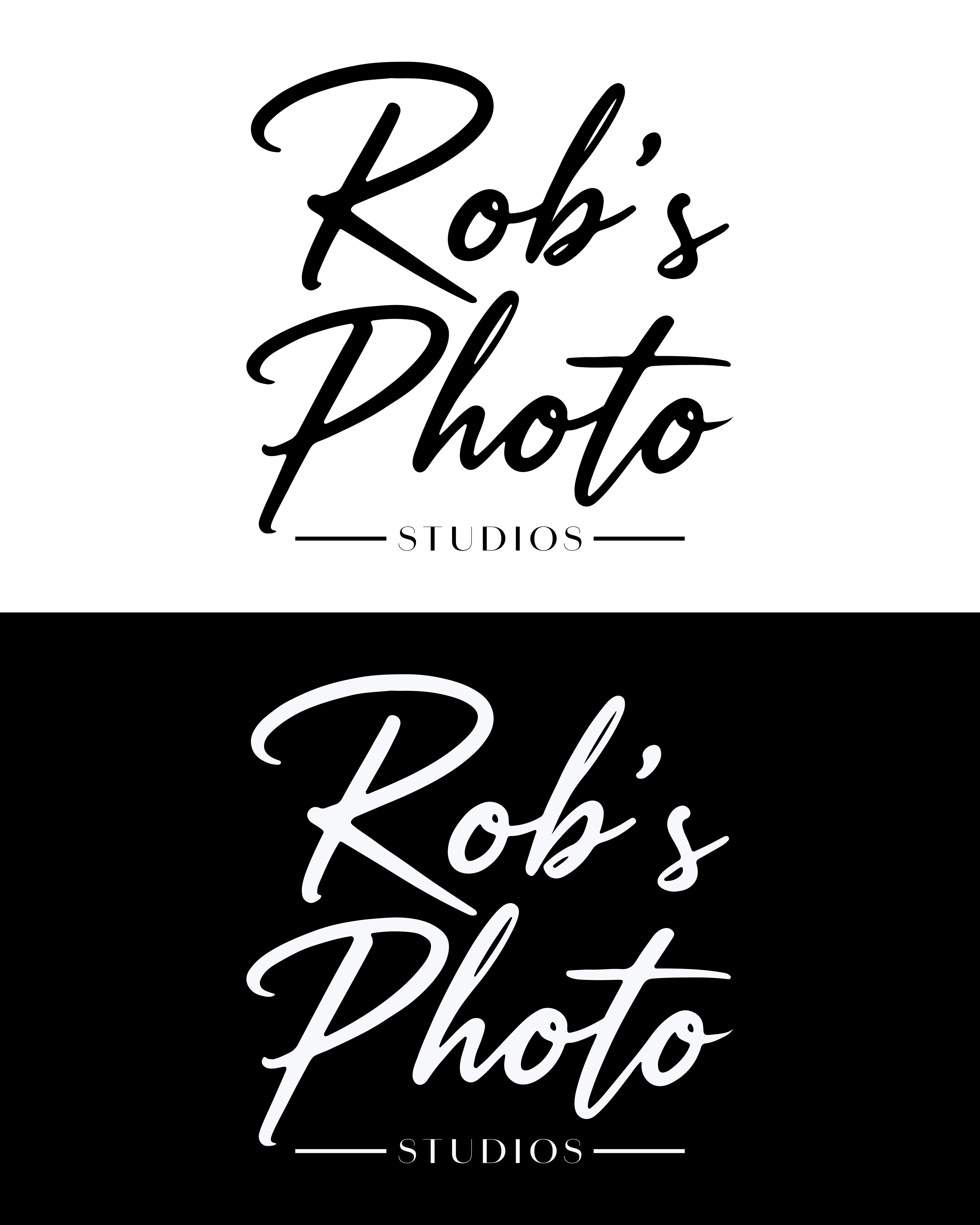
A set of typographical logos designed for a photography studio.
These logos were created to modernize the visual identity of a photography studio. The design approach focused on cleanliness, clarity, and readability to ensure strong visual impact across applications. A bold script typeface was used for the primary name, paired with a clean sans-serif subtitle to create balance and hierarchy. The development process incorporated market research and current branding trends with the goal of achieving a timeless result.


