.jpg)
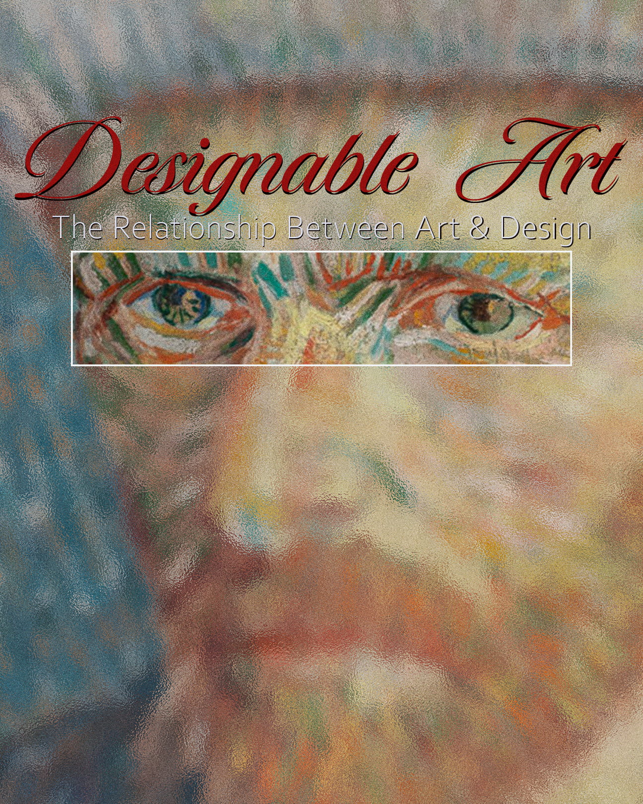
A look into the connection of Art and design and how they share visual principles and creative processes, with their key differences in intention.
Design cannot be without art and art cannot be without design. They are complementary disciplines where instances of each can be found in one another. Often, the relationship between the two is overlooked, but in reality they have more in common than they do in difference. Whether it's Da Vinci's Mona Lisa or Otl Aicher's branding for the 1972 Munich Olympic Games, there is no shortage of shared principles between both fields.
Art and design exist in the physical and conceptual sense. Physical in the manner in which they are visually experienced and conceptual in their foundations for creation. Art is synonymous with drawings and film through free and expressive intention. Design is typically associated with logos and posters with a specific end goal in mind. Art is meant to be inferred whereas design is meant to inform. However, these distinctions are not concrete in how they are utilized with one another. In actuality, they share instances of each within themselves, an amalgamation of concepts, principles, and practices.
Concepts like color theory, golden ratios, and lighting are found in both art pieces and design works. Color theory is a fundamental practice that both mediums share. The ability to put varying colors together to generate a cohesive piece is seen from paintings made by Picasso all the way to brand adverts made by Nike designers. The same can be said for lighting and layout principles. A creative photoshoot of a person in Rembrandt lighting with graphic overlays is no different than a photoshoot of a product in split lighting with branding elements added on top. The difference lies in the intention before and after the final result, but the similarities exist in the production phases.
Da Vinci's Mona Lisa is believed to have been completed between the years of 1503 and 1506. What's fascinating about Da Vinci's work is his incredible attention to detail and his efforts toward perfection. This led him to use the golden ratio extensively in many of his works, including the Mona Lisa. The golden ratio is a layout principle where squares are arranged in a spiraling pattern using the Fibonacci sequence to create more natural proportions in a composition. Otl Aicher, a German designer, was in charge of the branding for the 1972 Munich Olympic Games. His approach to the designs relied heavily on mathematical equations and a modular grid system similar to the golden ratio.
So if one of the world's most innovative painters and a well-renowned brand designer both utilized design and art principles in their largest works, then where does the difference lie? Yes, one is a painting and the other is branding. One is considered art and the other is considered design. Yet both share the same principles of composition, layout, and color theory. Of course, there are concepts not shared by each such as painting techniques used by Da Vinci and brand psychology used by Aicher. However, the intention between the two is what ultimately sets them apart.
As said before, art is meant to be inferred whereas design is meant to inform. A painting by Van Gogh is left up to the viewer's subjective understanding, but a poster for Dior's Sauvage cologne is concrete in its meaning. But what happens in its execution is common ground. In that moment, an artist becomes a designer and a designer becomes an artist.
.jpg)