
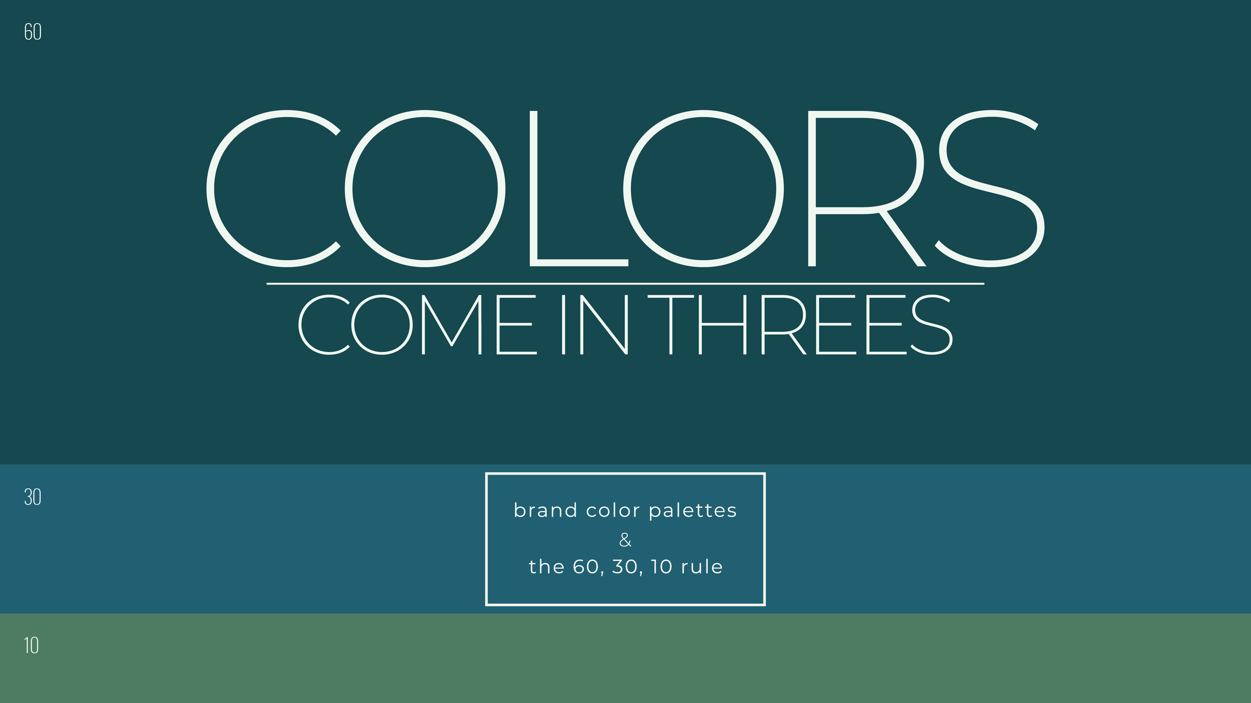
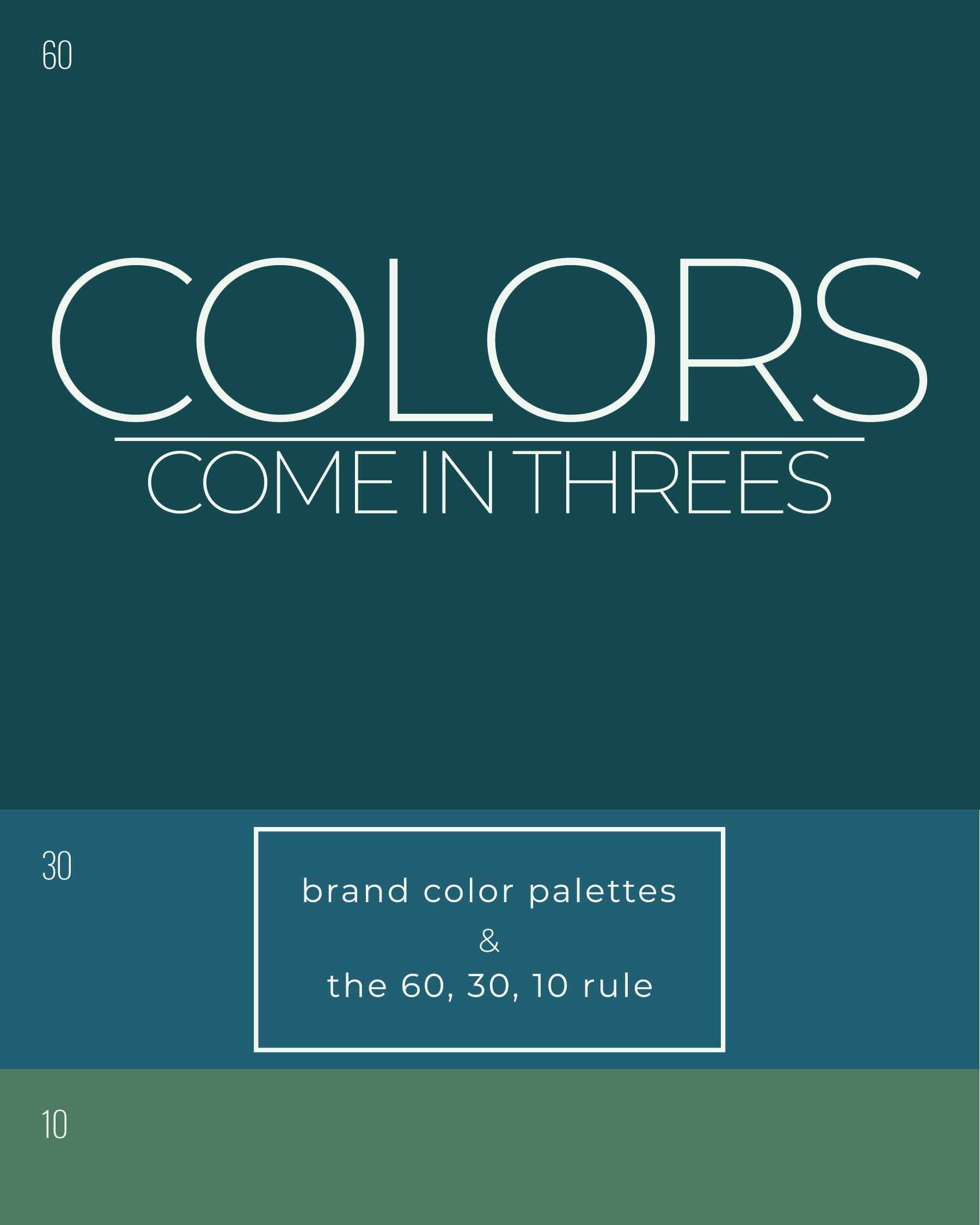
The 60, 30, 10 rule is a foundational principle in brand design, emphasizing balance and hierarchy in color usage. Whether bold or monochrome, successful brands use color intentionally, guided by industry, energy, and consistency rather than rigid rules, creating cohesive and memorable visual identities.
Within the world of brand design, there’s a commonly followed principle when it comes to choosing color palettes: the 60, 30, 10 rule. It states that within any given composition, the primary color should be used 60% of the time, the secondary color 30%, and the accent color 10%. It’s a simple rule, but one that’s proven to work time and time again. And it doesn’t just apply to branding, this idea shows up in photography, graphic design, and visual composition as a whole.
Most brand color palettes are built in threes, with one primary, one secondary, and one accent color. These colors are used consistently across different mediums, from posters and flyers to websites and apps. Pepsi is a great example, using blue, white, and red. Blue leads the way, white supports text and structure, and red steps in as an accent. That said, color isn’t everything. How colors are used can shift depending on the situation. The primary color should stay consistent, while secondary and accent colors can be more flexible.
When choosing colors, things don’t need to be overcomplicated. Color is just one piece of a brand’s visual identity and should work alongside everything else. Sometimes more color makes sense, and other times sticking to a single primary color works better. Black and white remains one of the most common palettes in branding. It’s simple, reliable, and memorable when done well. Brands that rely on black and white often put more emphasis on styling, energy, and how color shows up in other ways.
Dior is a perfect example. Their branding is strictly black and white, with color coming through photography and fashion. Many fashion brands follow this approach, including Chanel, Armani, Adidas, and Nike. Hardware brands tend to be bold and bright, like Milwaukee’s red or DeWalt’s yellow. Tech brands often lean into blues, like Samsung, Microsoft, and IBM, while others prefer a monochrome look, like Apple. A brand’s colors are closely tied to its industry, audience, and the energy it wants to project.
At the end of the day, the 60, 30, 10 rule isn’t about strict structure, it’s about balance. Even monochrome brands can apply it through contrast and hierarchy. Strong branding comes from clarity and cohesion, not using more color than necessary. The reason this rule still works is simple: it aligns with how people naturally take in visual information, making it a timeless tool in branding and design.


.png)
