A look into how varying compositional principles can be utilized to your advantage. Rule of Thirds, Golden Ratio and others all help to raise the bar in your visuals through excellent framing. Towering above the competition in composition.
In any visual medium, composition is one of the most important concepts. The arrangement of elements guides the viewer toward the goal of the designer, photographer, filmmaker, or even a brand. Whether the intention is to evoke a specific emotion or prompt a user to take action, composition plays a critical role.
How subjects are placed within a frame is crucial. With so many compositional methodologies available, it can be difficult to know which ones to follow and when to apply them.
The Rule of Thirds: One of the most common compositional guides, frequently used in photography and film. It divides the frame into nine equal sections using two vertical and two horizontal lines. This creates four intersection points around the center of the frame.
Placing a subject on or near one of these intersection points often creates a more dynamic and visually interesting image than centering the subject. Alternatively, positioning a subject between the two vertical lines can help maintain balance while still allowing room for movement or negative space. This rule is especially effective for landscapes, portraits, and scenes with clear focal points.
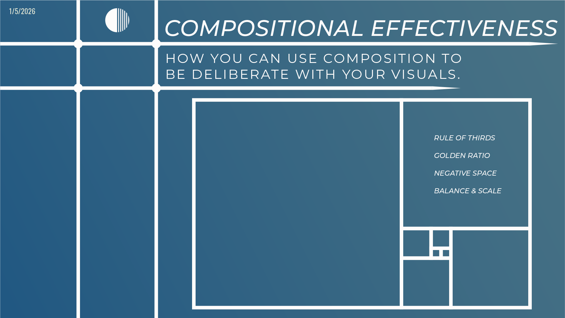
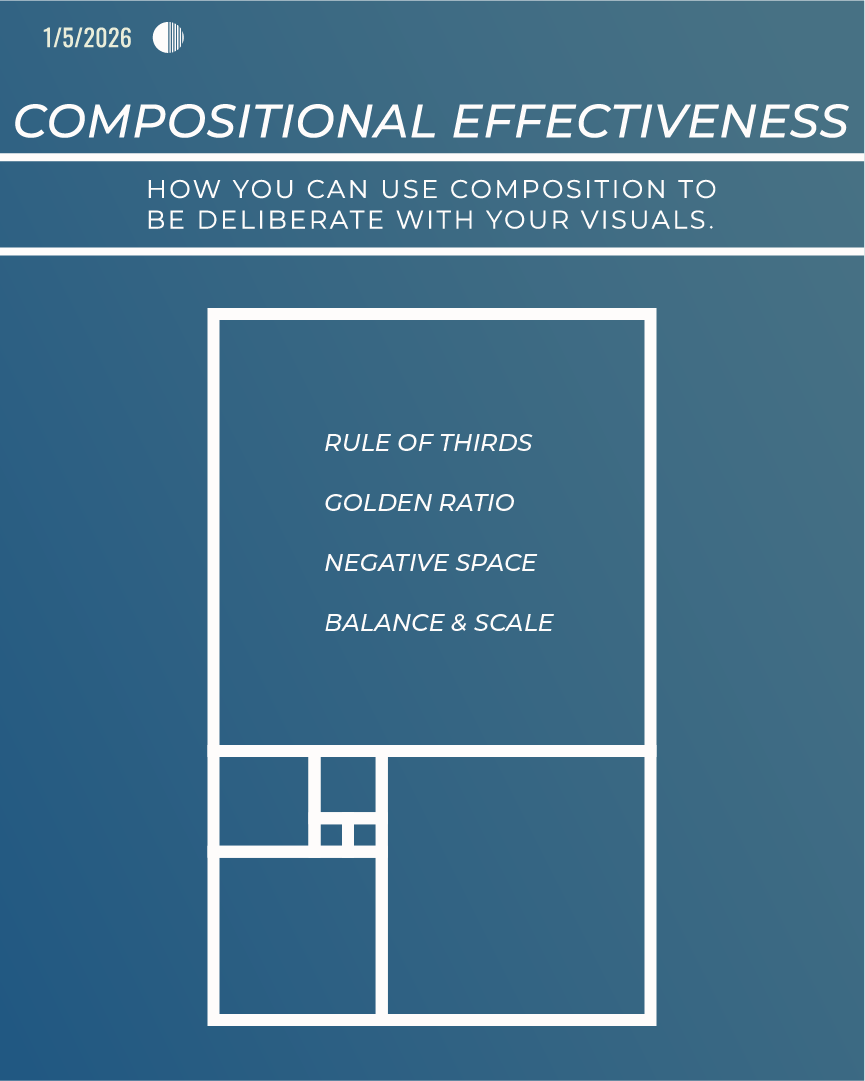
The Golden Ratio: A mathematically driven compositional guide based on the Fibonacci sequence. The ratio, approximately 1:1.618, creates a natural sense of flow that directs the viewer’s eye with precision. Visually, it is often represented as a series of progressively smaller squares that form a spiral when connected.
What makes the Golden Ratio powerful is its ability to arrange elements in a way that feels both asymmetrical and harmonious. The viewer may not consciously notice the structure, but it creates a strong subconscious pull. This method is commonly seen in classical art, architecture, logo design, and even modern UI layouts.
Negative Space: The empty or unoccupied areas surrounding a subject. Rather than being wasted space, negative space helps define and emphasize the main focal point. It gives the viewer’s eye room to rest and prevents compositions from feeling cluttered or overwhelming.
Effective use of negative space can convey simplicity, elegance, or isolation, depending on the intent. In branding and interface design, negative space is often used to improve readability and draw attention to calls to action or key messaging.
Balance and Scale: How visual weight is distributed within a composition. Balance can be symmetrical, where elements mirror each other, or asymmetrical, where different elements achieve equilibrium through contrast in size, color, or placement.
Scale refers to the relative size of elements and can be used to establish hierarchy or emphasis. Larger elements naturally draw more attention, while smaller ones support the overall structure. Manipulating scale can communicate importance, create depth, or influence how powerful or intimate a subject feels within the frame.